Our Logo
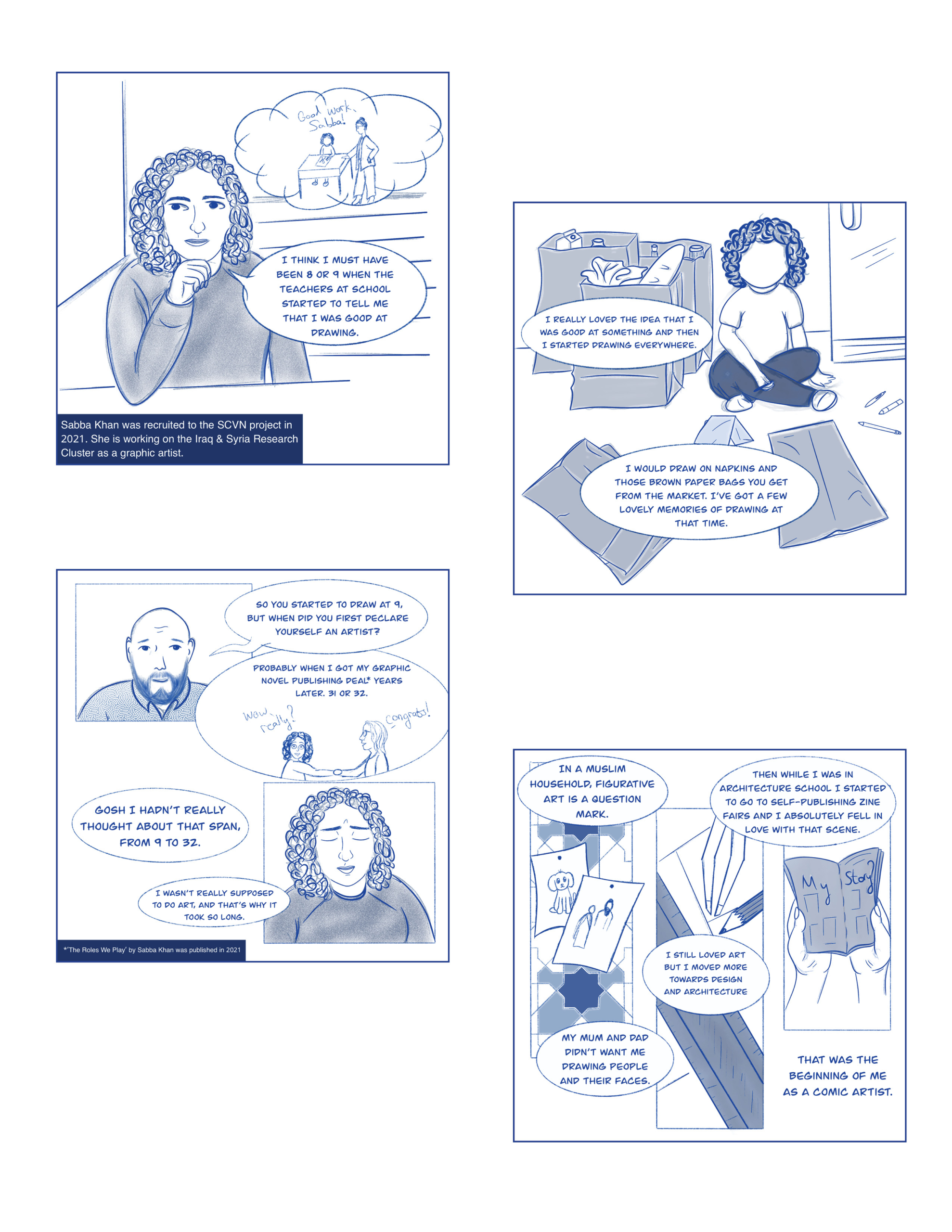
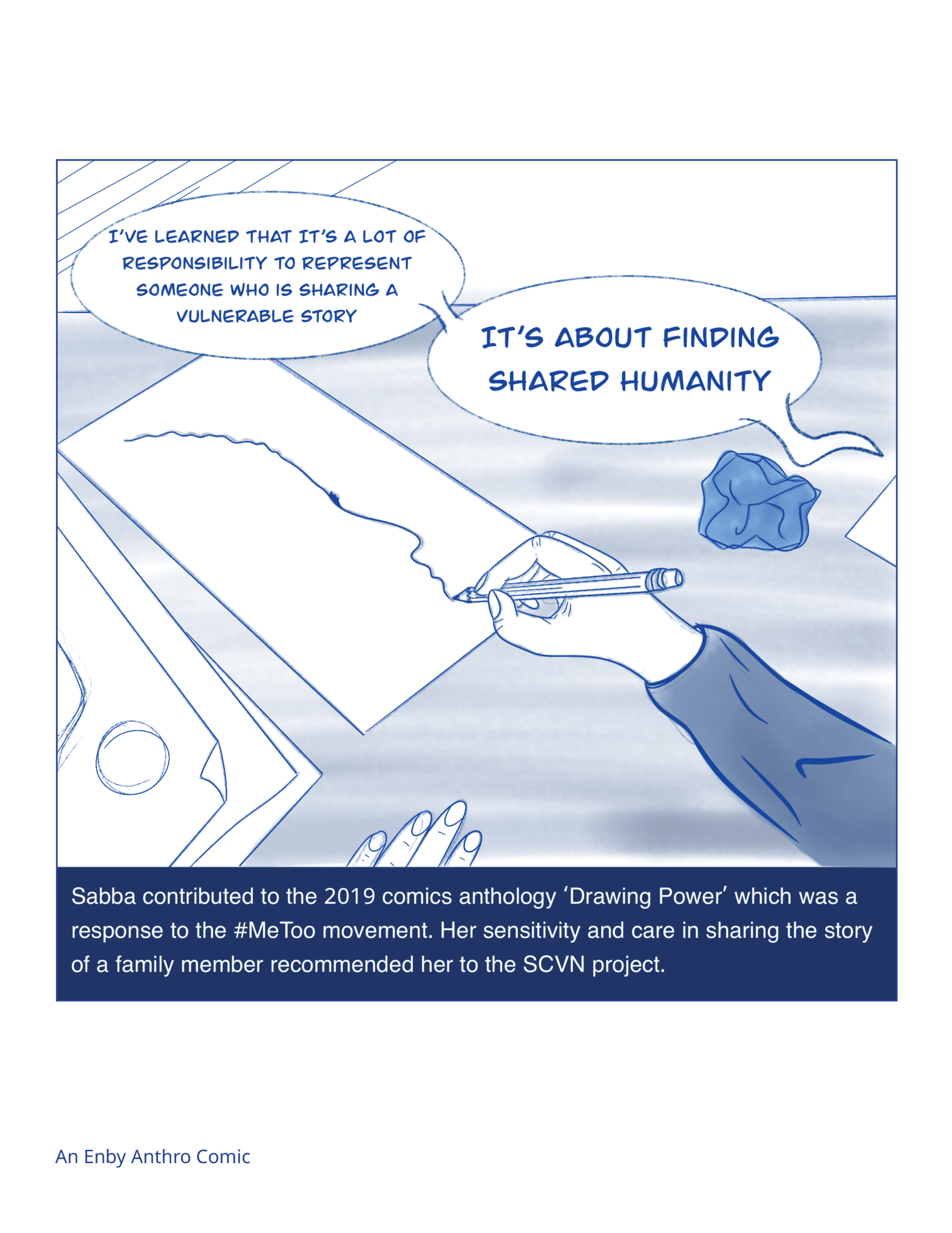
While a logo design may seem like a straightforward undertaking, the SCVN project is uniquely positioned to consider the unexpected impacts of visual media. When working with communities who continue to be misrepresented or stereotyped, it is doubly important to keep in mind that images are not neutral. Images carry the weight of the viewer’s assumptions and risk falling into harmful legacies if used carelessly. When it came time to create the SCVN project logo, we were fortunate to work with graphic artist Sabba Khan who responded to these challenges of representation with great care and thoughtfulness.
There were a number of questions and considerations that framed the creation of the logo. Given the violent and traumatic nature of the topics engaged by this project, it was a priority that the project logo would not reproduce violent imagery. While the reality of the issues we work with is not something we hide from, our commitment to working with a trauma-informed approach requires us to be considerate of how some imagery can be triggering or upsetting, particularly for survivors of violent experiences. We actively avoided using design elements resembling fingerprints, hatching edged like barbed wire, and any harsh markings that would suggest erasure.
SCVN Co-Director Charlotte Schallié also insisted that the logo design and overall project colour scheme avoid using black wherever possible to emphasize, even in subtle ways, that this project is fundamentally about hope. The shades of blue in the final design tap into the power of a visual progression from darkness to light without recreating negative connotations of racial hierarchy or unintentionally referencing the colours of any national flag or symbol. For SCVN Project Manager, Jennifer Sauter, the blues in the logo also represent a needed link to the first stage of the project which set the tone for the work to come.
The logo is not just a symbol of the project, it is a symbol of the community we are building.
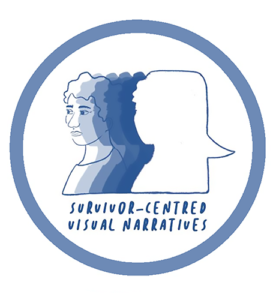
A second consideration guiding the logo design was the SCVN project focus on drawing and creativity. In the SCVN project, graphic novels are not simply a convenient (and popular) form of media, they are the defining methodology of this work. Drawing, as it is employed in the relationships between artists and survivors, shifts the power dynamic that characterizes traditional research. To sit and draw with someone while they share their story is to make a commitment to listen, to spend time, and to hold space for memory and truth to emerge. While this sense of connection and collaboration is key to the interviews and meetings with survivors, it is also key to the structure of the project itself which is defined by a non-hierarchal leadership structure. The final logo design is circular, alluding to the project focus on community and open, ongoing conversation. The design also calls to mind a speech bubble which is a defining visual associated with graphic novels.
A final consideration that framed the logo design process was the need for this design to represent the five Research Clusters: Holocaust, Rwanda, Iraq & Syria, Yugoslav Wars, and Turtle Island. Each of these Research Clusters is grounded in a different foundational issue and while we must avoid painting all mass atrocities with the same brush, we can find ways to mutually support and acknowledge each other through participation in the broader SCVN project. The final logo design shows a wide range of human faces, representing many features, hair types, genders, and ages, and creating space for all to be represented and included. As SCVN Data Director, Matt Huculak put it, “When you see that logo stamped on the corner of something – a photo, drawing, or anything – it’s connecting that work to something bigger.” The logo is not just a symbol of the project, it is a symbol of the community we are building.
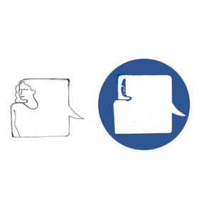
Drafts of the logo experimenting with the imagery of the speech bubble.


